

1、点,线,面
点:points,线:abline,lines,segments,面:box,polygon,polypath,rect,特殊的:arrows,symbols
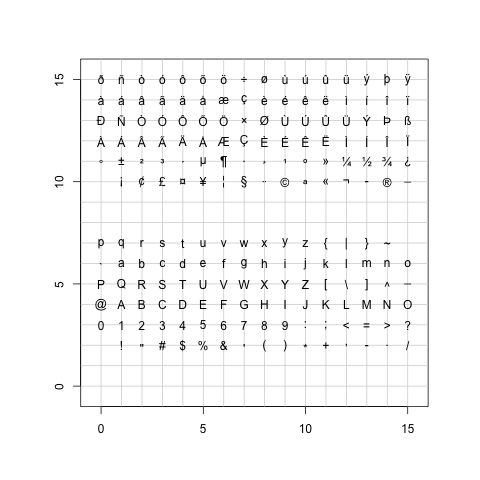
points不仅仅可以画前文中pch所设定的任意一个符号,还可以以字符为符号。
|
画点
abline可以由斜率和截距来确定一条直线,lines可以连接两个或者多个点,segments可以按起止位置画线。
|

线段
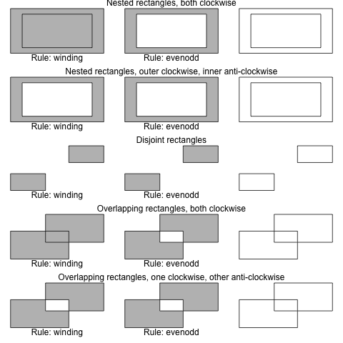
box画出当前盒子的边界,polygon画多边形,polypath画路径,rect画距形。
|
多边形
路径
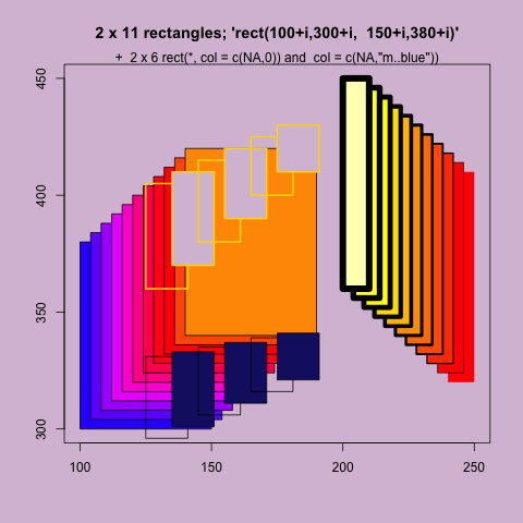
矩形
arrows用于画箭头,symbols用于画符号
|
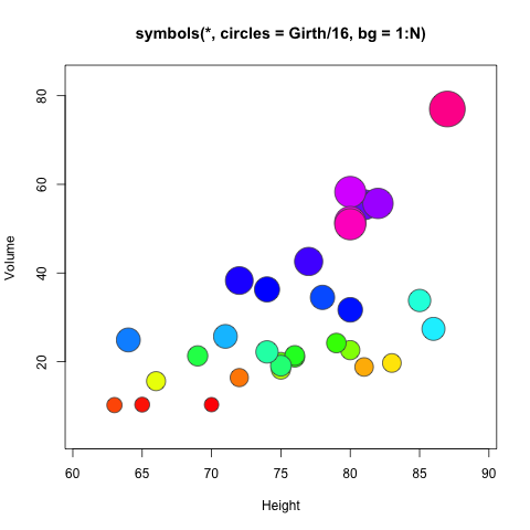
符号
画圆
|
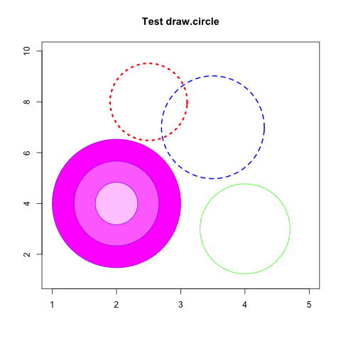
圆
2、散点图及趋势线
一维点图使用dotchart函数。
|
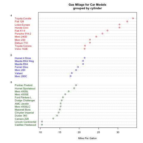
一维点图
二维散点图使用plot函数。直趋势线使用abline函数,拟合曲线在拟合后使用line函数绘制。
|
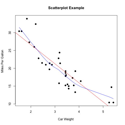
点阵图
3、曲线
曲线使用lines函数。其type参数可以使用”p”,”l”,”o”,”b,c”,”s,S”,”h”,”n”等。
|
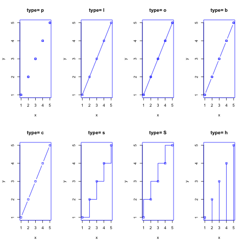
曲线
4、柱状图
普通的柱状图使用barplot函数。其参数horiz=TRUE表示水平画图,beside=TRUE表示如果是多组数据的话,在并排画图,否则原位堆叠画图。
|
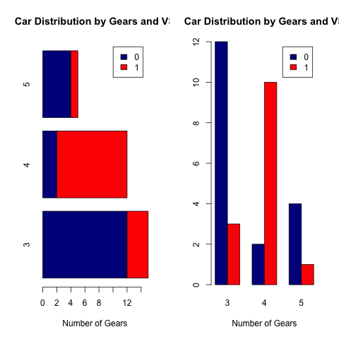
bar图
柱状统计图使用hist函数。其breaks参数设置每组的范围。使用density函数可以拟合曲线。
|
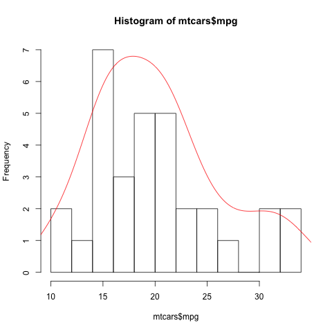
柱状图
5、饼图
饼图使用pie函数。
|
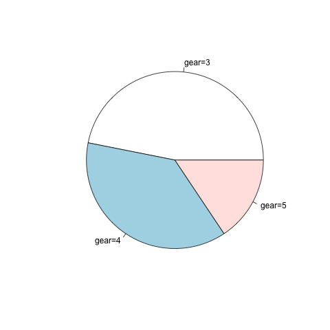
饼图
3维饼图使用plotrix库中的pie3D函数。
|
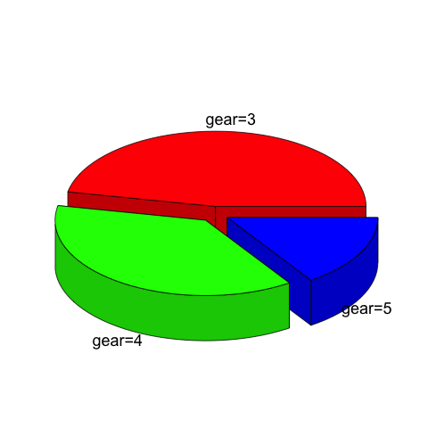
3D饼图
6、箱线图
箱线图使用boxplot函数。boxplot中参数x为公式。R中的公式如何定义呢?最简单的 y ~ x 就是y是x的一次函数。好了,下面就是相关的符号代表的意思:
| 符号 | 示例 | 意义 |
| + | +x | 包括该变量 |
| – | -x | 不包括该变量 |
| : | x:z | 包括两变量的相互关系 |
| * | x*z | 包括两变量,以及它们之间的相互关系 |
| / | x/z | nesting: include z nested within x |
| | | x|z | 条件或分组:包括指定z的x |
| ^ | (u+v+w)^3 | include these variables and all interactions up to three way |
| poly | poly(x,3) | polynomial regression: orthogonal polynomials |
| Error | Error(a/b) | specify the error term |
| I | I(x*z) | as is: include a new variable consisting of these variables multiplied |
| 1 | -1 | 截距:减去该截距 |
|
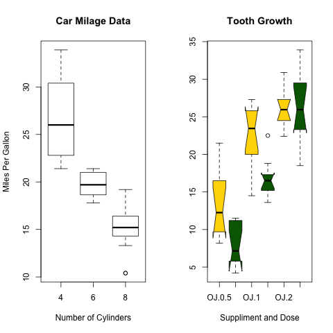
箱线图
如果我想在箱线图上叠加样品点,即所谓的蜂群图,如何做呢?
|
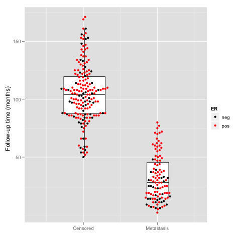
蜂群图
|
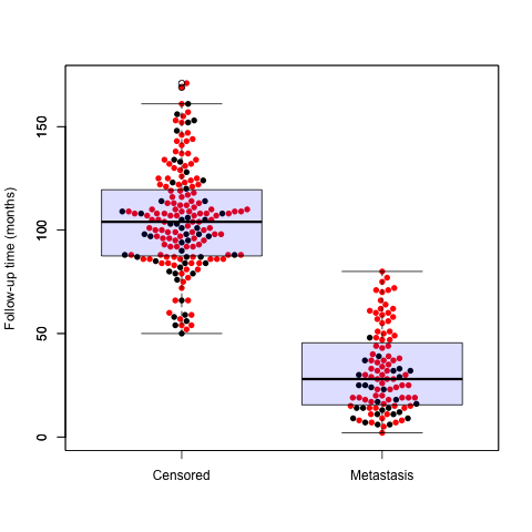
蜂群图
7、分枝树
|
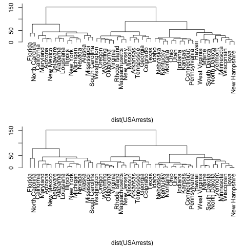
分枝树
8、文氏图
|
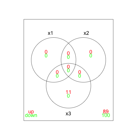
文氏图