

线图
线图是反映趋势变化的一种方式,其输入数据一般也是一个矩阵。
单线图
假设有这么一个矩阵,第一列为转录起始位点及其上下游5 kb的区域,第二列为H3K27ac修饰在这些区域的丰度,想绘制一张线图展示。
- profile="Pos;H3K27ac
- -5000;8.7
- -4000;8.4
- -3000;8.3
- -2000;7.2
- -1000;3.6
- 0;3.6
- 1000;7.1
- 2000;8.2
- 3000;8.4
- 4000;8.5
- 5000;8.5"
读入数据
- profile_text <- read.table(text=profile, header=T, row.names=1, quote="",sep=";")
- profile_text
- H3K27ac
- -5000 8.7
- -4000 8.4
- -3000 8.3
- -2000 7.2
- -1000 3.6
- 0 3.6
- 1000 7.1
- 2000 8.2
- 3000 8.4
- 4000 8.5
- 5000 8.5
- # 在melt时保留位置信息
- # melt格式是ggplot2画图最喜欢的格式
- # 好好体会下这个格式,虽然多占用了不少空间,但是确实很方便
- # 这里可以用 `xvariable`,也可以是其它字符串,但需要保证后面与这里的一致
- # 因为这一列是要在X轴显示,所以起名为`xvariable`。
- profile_text$xvariable = rownames(profile_text)
- library(ggplot2)
- library(reshape2)
- data_m <- melt(profile_text, id.vars=c("xvariable"))
- data_m
- xvariable variable value
- 1 -5000 H3K27ac 8.7
- 2 -4000 H3K27ac 8.4
- 3 -3000 H3K27ac 8.3
- 4 -2000 H3K27ac 7.2
- 5 -1000 H3K27ac 3.6
- 6 0 H3K27ac 3.6
- 7 1000 H3K27ac 7.1
- 8 2000 H3K27ac 8.2
- 9 3000 H3K27ac 8.4
- 10 4000 H3K27ac 8.5
- 11 5000 H3K27ac 8.5
然后开始画图,与上面画heatmap一样。
- # variable和value为矩阵melt后的两列的名字,内部变量, variable代表了点线的属性,value代表对应的值。
- p <- ggplot(data_m, aes(x=xvariable, y=value),color=variable) + geom_line()
- p
- # 图会存储在当前目录的Rplots.pdf文件中,如果用Rstudio,可以不运行dev.off()
- dev.off()
满心期待一个倒钟形曲线,结果,
什么也没有。
仔细看,出来一段提示
- geom_path: Each group consists of only one observation.
- Do you need to adjust the group aesthetic?
原来默认ggplot2把每个点都视作了一个分组,什么都没画出来。而data_m中的数据都来源于一个分组H3K27ac,分组的名字为variable,修改下脚本,看看效果。
- p <- ggplot(data_m, aes(x=xvariable, y=value,color=variable,group=variable)) +
- geom_line() + theme(legend.position=c(0.1,0.9))
- p
- dev.off()
图出来了,一条线,看一眼没问题;再仔细看,不对了,怎么还不是倒钟形,原来横坐标错位了。
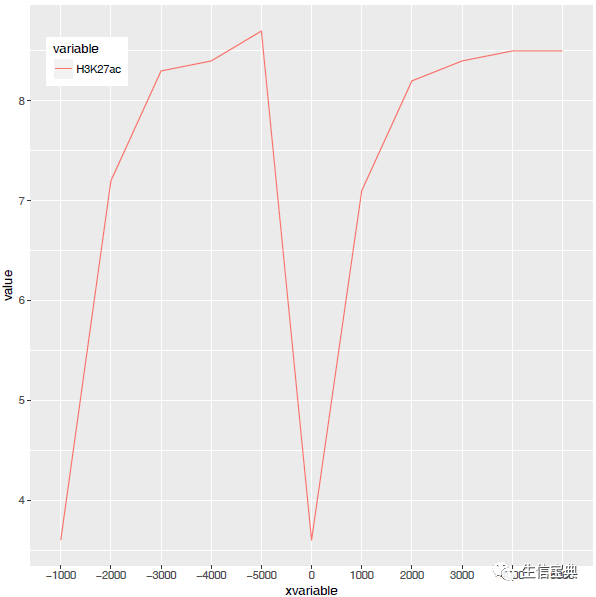
检查下数据格式
- summary(data_m)
- xvariable variable
- Length:11 H3K27ac:11
- Class :character
- Mode :character
问题来了,xvariable虽然看上去数字,但存储的实际是字符串 (因为是作为行名字读取的),需要转换为数字。
- data_m$xvariable <- as.numeric(data_m$xvariable)
- #再检验下
- is.numeric(data_m$xvariable)
- [1] TRUE
好了,继续画图。
- # 注意断行时,加号在行尾,不能放在行首
- p <- ggplot(data_m, aes(x=xvariable, y=value,color=variable,group=variable)) +
- geom_line() + theme(legend.position=c(0.1,0.8))
- p
- dev.off()
图终于出来了,调了下legend的位置,看上去有点意思了。

有点难看,如果平滑下,会不会好一些,stat_smooth可以对绘制的线进行局部拟合。在不影响变化趋势的情况下,可以使用 (但慎用)。
- p <- ggplot(data_m, aes(x=xvariable, y=value,color=variable,group=variable)) +
- geom_line() + stat_smooth(method="auto", se=FALSE) +
- theme(legend.position=c(0.1,0.8))
- p
- dev.off()
从图中看,趋势还是一致的,线条更优美了。另外一个方式是增加区间的数量,线也会好些,而且更真实。
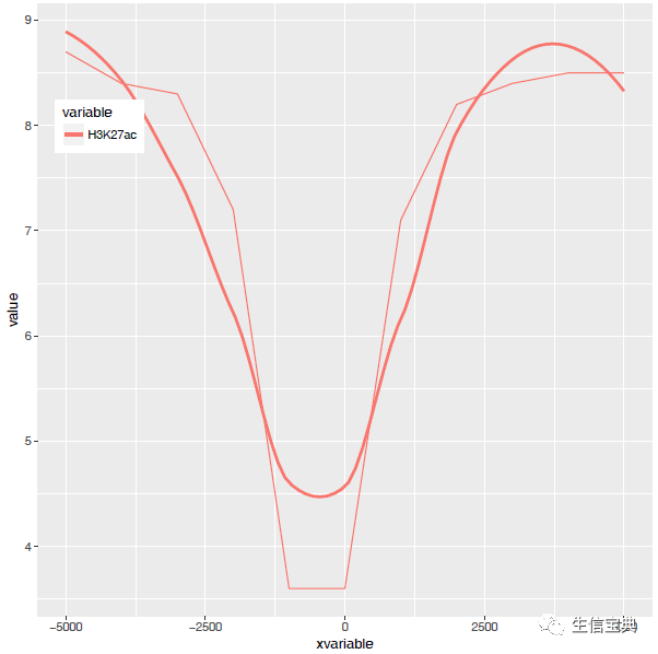
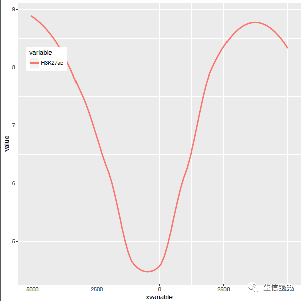
stat_smooth和geom_line各绘制了一条线,只保留一条就好。
- p <- ggplot(data_m, aes(x=xvariable, y=value,color=variable,group=variable)) +
- stat_smooth(method="auto", se=FALSE) + theme(legend.position=c(0.1,0.8))
- p
- dev.off()
好了,终于完成了单条线图的绘制。
多线图
那么再来一个多线图的例子吧,只要给之前的数据矩阵多加几列就好了。
- profile = "Pos;h3k27ac;ctcf;enhancer;h3k4me3;polII
- -5000;8.7;10.7;11.7;10;8.3
- -4000;8.4;10.8;11.8;9.8;7.8
- -3000;8.3;10.5;12.2;9.4;7
- -2000;7.2;10.9;12.7;8.4;4.8
- -1000;3.6;8.5;12.8;4.8;1.3
- 0;3.6;8.5;13.4;5.2;1.5
- 1000;7.1;10.9;12.4;8.1;4.9
- 2000;8.2;10.7;12.4;9.5;7.7
- 3000;8.4;10.4;12;9.8;7.9
- 4000;8.5;10.6;11.7;9.7;8.2
- 5000;8.5;10.6;11.7;10;8.2"
- profile_text <- read.table(text=profile, header=T, row.names=1, quote="",sep=";")
- profile_text$xvariable = rownames(profile_text)
- data_m <- melt(profile_text, id.vars=c("xvariable"))
- data_m$xvariable <- as.numeric(data_m$xvariable)
- # 这里group=variable,而不是group=1 (如果上面你用的是1的话)
- # variable和value为矩阵melt后的两列的名字,内部变量, variable代表了点线的属性,value代表对应的值。
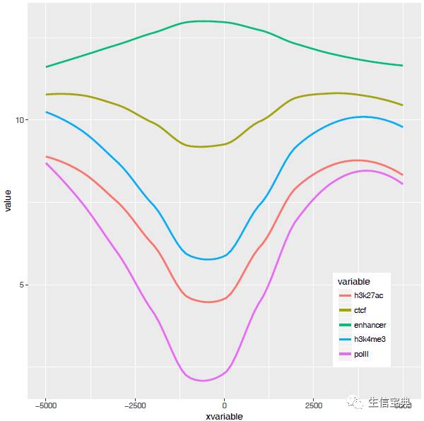
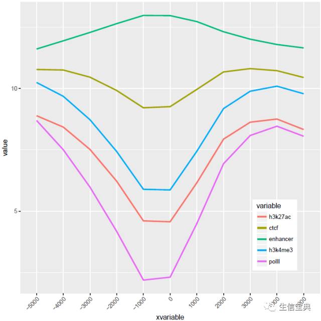
- p <- ggplot(data_m, aes(x=xvariable, y=value,color=variable,group=variable)) +
- stat_smooth(method="auto", se=FALSE) + theme(legend.position=c(0.85,0.2))
- p
- dev.off()
横轴文本线图
如果横轴是文本,又该怎么调整顺序呢?还记得之前热图旁的行或列的顺序调整吗?重新设置变量的factor水平就可以控制其顺序。
- profile = "Pos;h3k27ac;ctcf;enhancer;h3k4me3;polII
- -5000;8.7;10.7;11.7;10;8.3
- -4000;8.4;10.8;11.8;9.8;7.8
- -3000;8.3;10.5;12.2;9.4;7
- -2000;7.2;10.9;12.7;8.4;4.8
- -1000;3.6;8.5;12.8;4.8;1.3
- 0;3.6;8.5;13.4;5.2;1.5
- 1000;7.1;10.9;12.4;8.1;4.9
- 2000;8.2;10.7;12.4;9.5;7.7
- 3000;8.4;10.4;12;9.8;7.9
- 4000;8.5;10.6;11.7;9.7;8.2
- 5000;8.5;10.6;11.7;10;8.2"
- profile_text <- read.table(text=profile, header=T, row.names=1, quote="",sep=";")
- profile_text_rownames <- row.names(profile_text)
- profile_text$xvariable = rownames(profile_text)
- data_m <- melt(profile_text, id.vars=c("xvariable"))
- # 就是这一句,会经常用到
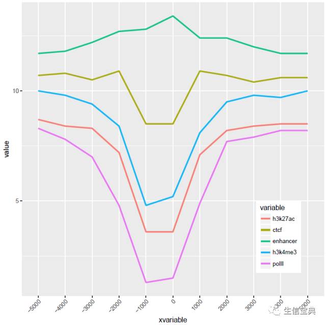
- data_m$xvariable <- factor(data_m$xvariable, levels=profile_text_rownames, ordered=T)
- # geom_line设置线的粗细和透明度
- p <- ggplot(data_m, aes(x=xvariable, y=value,color=variable,group=variable)) +
- geom_line(size=1, alpha=0.9) + theme(legend.position=c(0.85,0.2)) +
- theme(axis.text.x=element_text(angle=45,hjust=1, vjust=1))
- # stat_smooth
- #p <- ggplot(data_m, aes(x=xvariable, y=value,color=variable,group=variable)) +
- # stat_smooth(method="auto", se=FALSE) + theme(legend.position=c(0.85,0.2)) +
- # theme(axis.text.x=element_text(angle=45,hjust=1, vjust=1))
- p
- dev.off()
比较下位置信息做为数字(前面的线图)和位置信息横轴的差别。当为数值时,ggplot2会选择合适的几个刻度做标记,当为文本时,会全部标记。另外文本横轴,smooth效果不明显 (下面第2张图)。
至此完成线图的基本绘制,虽然还可以,但还有不少需要提高的地方,比如在线图上加一条或几条垂线、加个水平线、修改X轴的标记(比如0换为TSS)、设置每条线的颜色等。具体且听下回一步线图法。