

PCA(Principal Component Analysis),即主成分分析方法,是一种使用最广泛的数据降维算法。在数据分析以及生信分析中会经常用到。
本文利用R语言的ggplot2包,从头带您绘制可发表级别的主成分分析图。
一 载入数据集和R包
- library(ggplot2)
- #使用经典iris数据集
- df <- iris[c(1, 2, 3, 4)]
- head(df)
- Sepal.Length Sepal.Width Petal.Length Petal.Width
- 1 5.1 3.5 1.4 0.2
- 2 4.9 3.0 1.4 0.2
- 3 4.7 3.2 1.3 0.2
- 4 4.6 3.1 1.5 0.2
- 5 5.0 3.6 1.4 0.2
- 6 5.4 3.9 1.7 0.4
二 进行主成分分析
- df_pca <- prcomp(df) #计算主成分
- df_pcs <-data.frame(df_pca$x, Species = iris$Species)
- head(df_pcs,3) #查看主成分结果
- PC1 PC2 PC3 PC4 Species
- 1 -2.684126 -0.3193972 0.02791483 0.002262437 setosa
- 2 -2.714142 0.1770012 0.21046427 0.099026550 setosa
- 3 -2.888991 0.1449494 -0.01790026 0.019968390 setosa
三 绘图展示
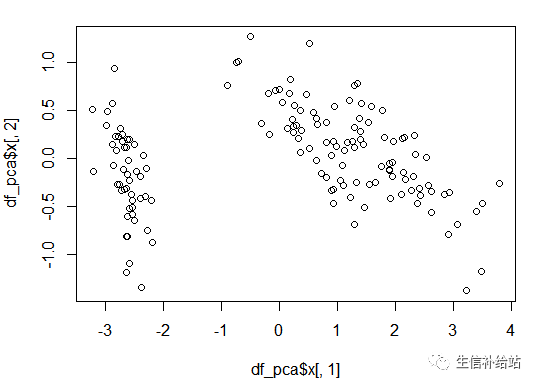
3.1 基础函数绘制PCA图
- plot(df_pca$x[,1], df_pca$x[,2])
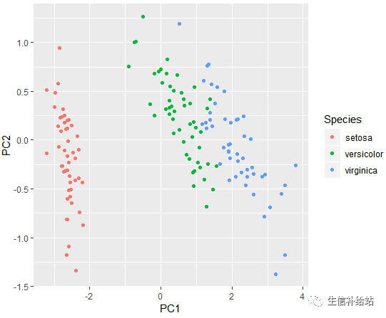
3.2 ggplot2 绘制PCA图
1) Species分颜色
- ggplot(df_pcs,aes(x=PC1,y=PC2,color=Species))+ geom_point()
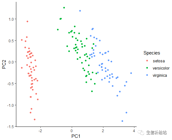
2)去掉背景及网格线
- ggplot(df_pcs,aes(x=PC1,y=PC2,color=Species))+
- geom_point()+
- theme_bw() +
- theme(panel.border=element_blank(),panel.grid.major=element_blank(),panel.grid.minor=element_blank(),axis.line= element_line(colour = "black"))
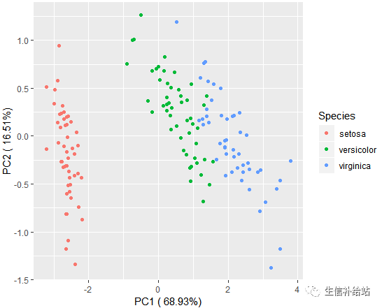
3) 添加PC1 PC2的百分比
- percentage<-round(df_pca$sdev / sum(df_pca$sdev) * 100,2)
- percentage<-paste(colnames(df_pcs),"(", paste(as.character(percentage), "%", ")", sep=""))
- ggplot(df_pcs,aes(x=PC1,y=PC2,color=Species))+
- geom_point()+
- xlab(percentage[1]) +
- ylab(percentage[2])
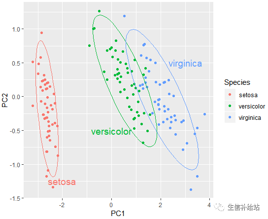
4) 添加置信椭圆
- ggplot(df_pcs,aes(x=PC1,y=PC2,color = Species))+ geom_point()+stat_ellipse(level = 0.95, show.legend = F) +
- annotate('text', label = 'setosa', x = -2, y = -1.25, size = 5, colour = '#f8766d') +
- annotate('text', label = 'versicolor', x = 0, y = - 0.5, size = 5, colour = '#00ba38') +
- annotate('text', label = 'virginica', x = 3, y = 0.5, size = 5, colour = '#619cff')
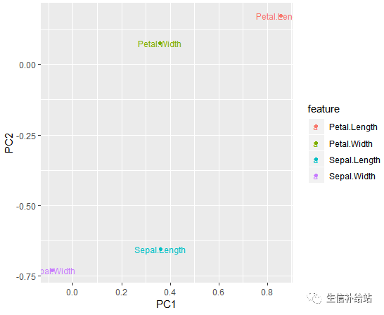
5) 查看各变量对于PCA的贡献
- df_r <- as.data.frame(df_pca$rotation)
- df_r$feature <- row.names(df_r)
- df_r
- PC1 PC2 PC3 PC4 feature
- Sepal.Length 0.36138659 -0.65658877 0.58202985 0.3154872 Sepal.Length
- Sepal.Width -0.08452251 -0.73016143 -0.59791083 -0.3197231 Sepal.Width
- Petal.Length 0.85667061 0.17337266 -0.07623608 -0.4798390 Petal.Length
- Petal.Width 0.35828920 0.07548102 -0.54583143 0.7536574 Petal.Width
贡献度绘图
- ggplot(df_r,aes(x=PC1,y=PC2,label=feature,color=feature )) + geom_point()+ geom_text(size=3)
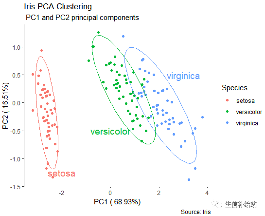
四 PCA绘图汇总展示
- ggplot(df_pcs,aes(x=PC1,y=PC2,color=Species )) + geom_point()+xlab(percentage[1]) + ylab(percentage[2]) + stat_ellipse(level = 0.95, show.legend = F) +
- annotate('text', label = 'setosa', x = -2, y = -1.25, size = 5, colour = '#f8766d') +
- annotate('text', label = 'versicolor', x = 0, y = - 0.5, size = 5, colour = '#00ba38') +
- annotate('text', label = 'virginica', x = 3, y = 0.5, size = 5, colour = '#619cff') + labs(title="Iris PCA Clustering",
- subtitle=" PC1 and PC2 principal components ", caption="Source: Iris") + theme_classic()
好了 ,更改数据集即可以自己动手绘制PCA了,生信分析得到的PCA的结果直接绘制即可。
1F
你这是什么软件,界面这么好看?