

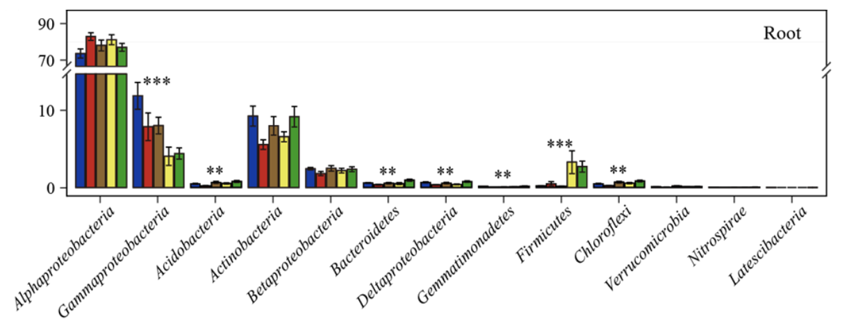
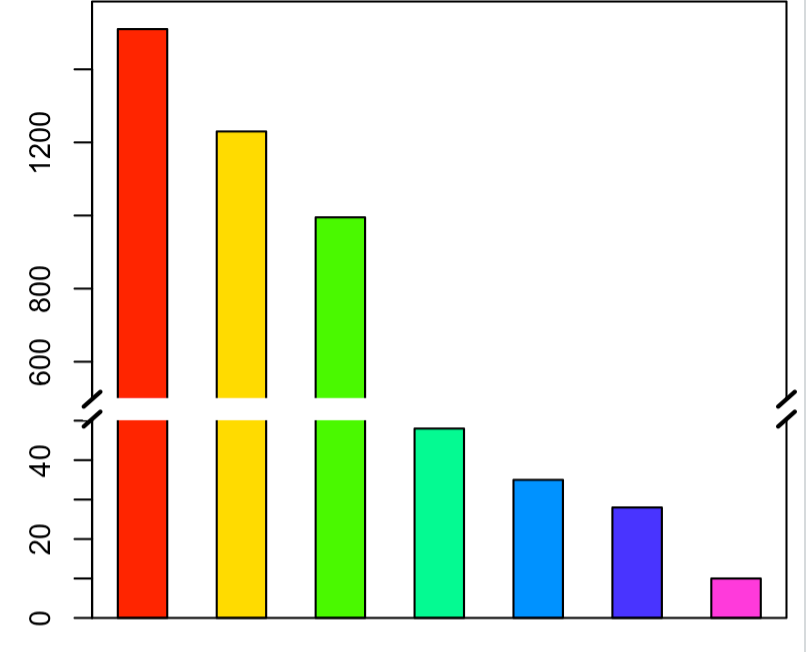
画图时经常遇到不同组的数据大小相差很大,大数据就会掩盖小数据的变化规律,这时候可以对Y轴进行截断,从而可以在不同层面(大数据和小数据层面)全面反映数据变化情况,如下图所示。
搜索截断图绘制的方法,有根据Excel绘制的,但是感觉操作繁琐;这里根据网上资料总结基于R的3种方法:
- 分割 组合法,如基于ggplot2, 利用
coord_cartesian()将整个图形分割成多个图片,再用grid 包组合分割结果 - plotrix R包
- 基本绘图函数 plotrix R包
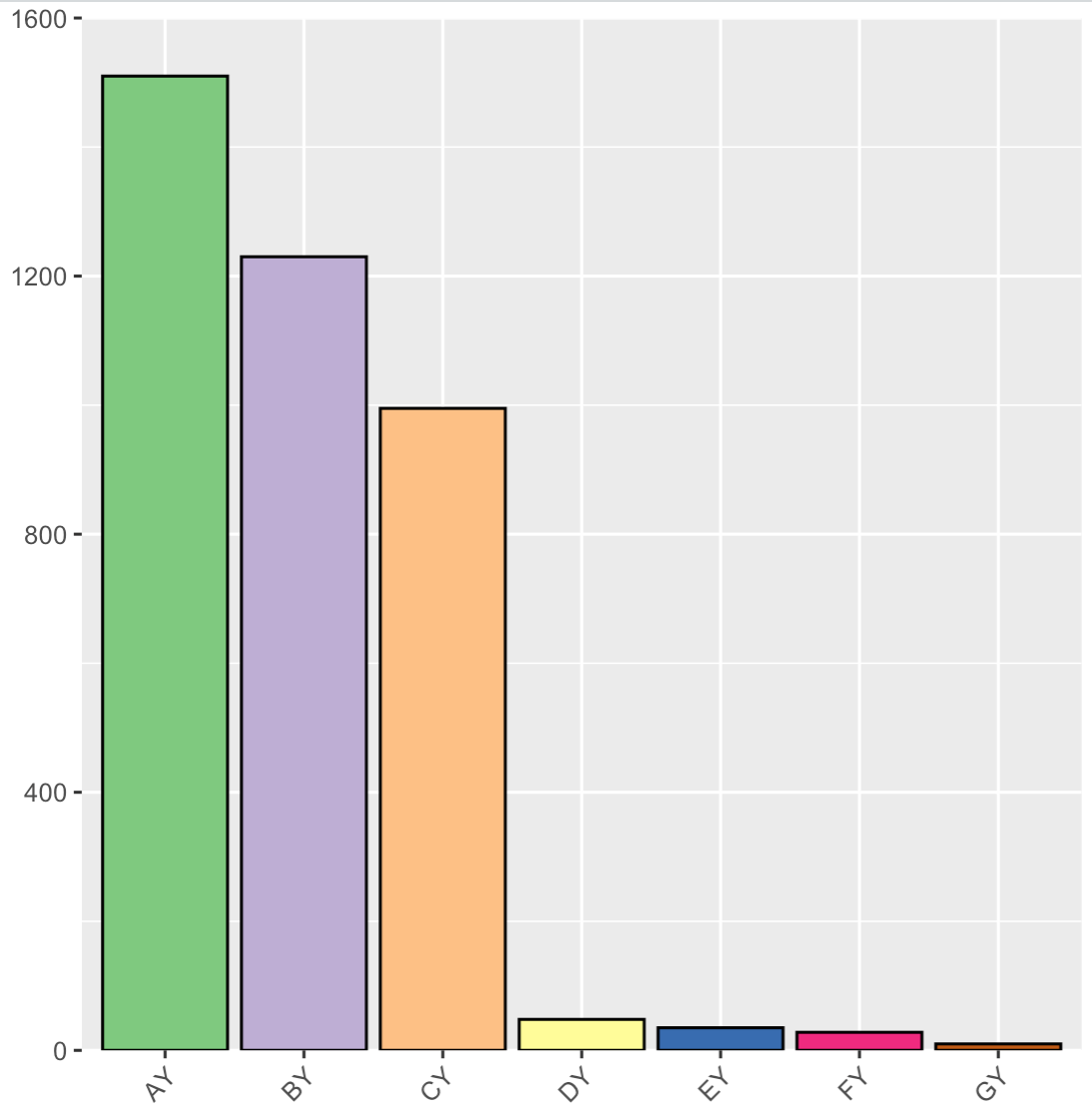
示例数据
- df <- data.frame(name=c("AY","BY","CY","DY","EY","FY","GY"),Money=c(1510,1230,995,48,35,28,10))
- df
- #加载 R 包
- library(ggplot2)
- # ggplot画图
- p0 <- ggplot(df, aes(name,Money,fill = name))
- geom_col(position = position_dodge(width = 0.8),color="black")
- labs(x = NULL, y = NULL)
- scale_fill_brewer(palette="Accent")
- #scale_x_discrete(expand = c(0, 0))
- scale_y_continuous(breaks = seq(0, 1600, 400), limits = c(0, 1600), expand = c(0,0))
- theme(axis.text.x = element_text(angle = 45, hjust = 1), legend.title = element_blank())
方法一:分割 组合法
这种方法的思路是分别绘制不同层级大小的图形,然后组合图形。如可一用ggplot2中的coord_cartesian()函数分割,ylim指定y轴的区间范围。
- ### 小数据层级
- p1 <- p0 coord_cartesian(ylim = c(0, 50))
- theme_classic()
- theme(legend.position="none")
- ### 大数据层级
- # 不显示X轴坐标和文本标记
- p2 <-p0 coord_cartesian(ylim = c(700, 1600))
- theme_classic()
- theme(axis.line.x = element_line(colour="white"),
- axis.text.x = element_blank(), axis.ticks.x = element_blank(),
- legend.position = c(0.85, 0.6))
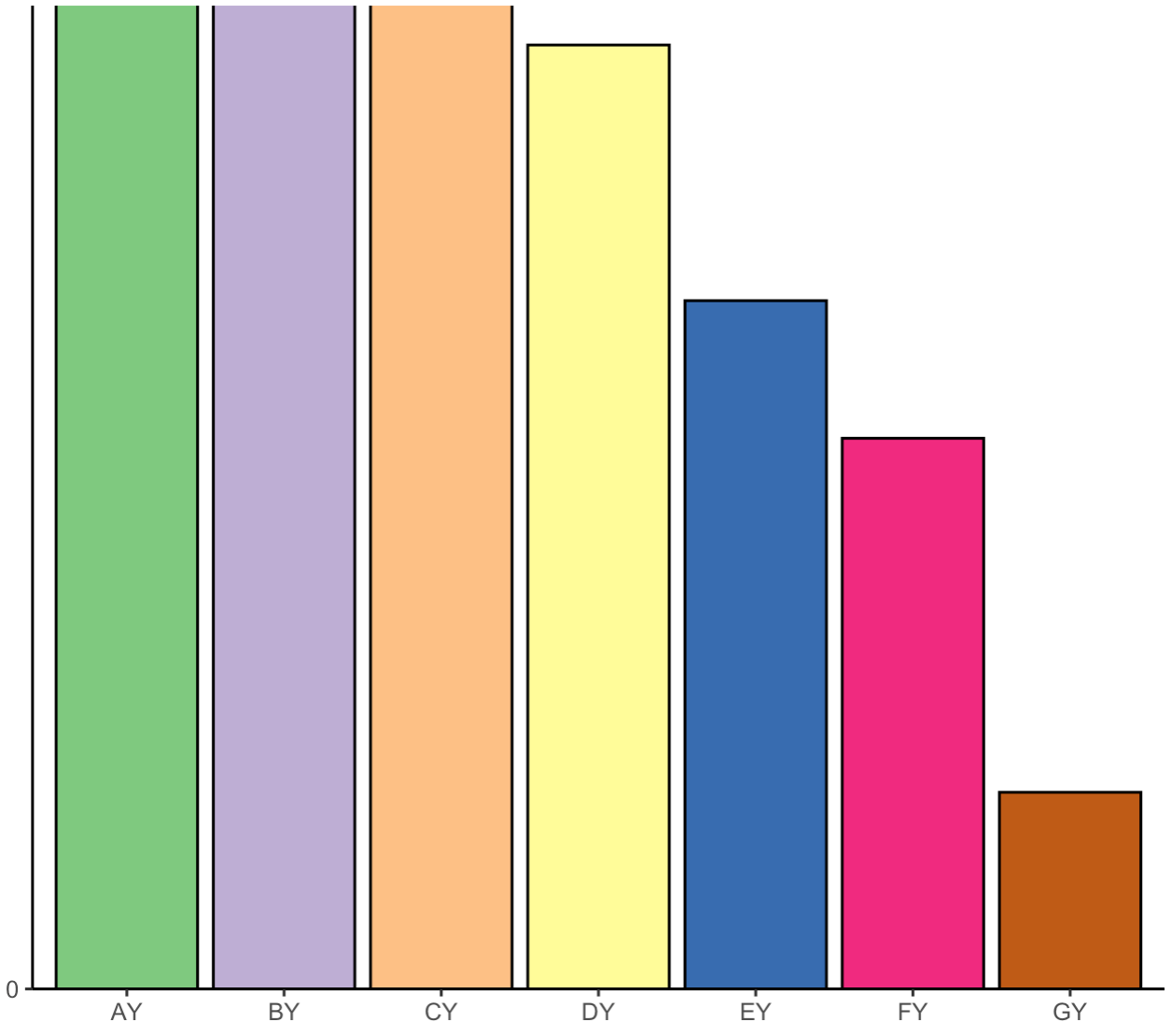
grid组合图形, grid.newpage()新建画布, viewport()命令将画板分割为不同的区域。
x和y分别用于指定所放置子图在画板中的坐标,坐标取值范围为0~1,并使用just给定坐标起始位置;width和height用于指定所放置子图在画板中的高度和宽度。
- library(grid)
- grid.newpage() #新建画布
- plot_site1 <- viewport(x = 0.008, y = 0, width = 0.994, height = 0.4, just = c(\'left\', \'bottom\'))
- plot_site2 <- viewport(x = 0.008, y = 0.4, width = 1, height = 0.5, just = c(\'left\', \'bottom\'))
- #plot_site3 <- viewport(x = 0, y = 0.7, width = 1, height = 0.3, just = c(\'left\', \'bottom\'))
- print(p1, vp = plot_site1)
- print(p2, vp = plot_site2)
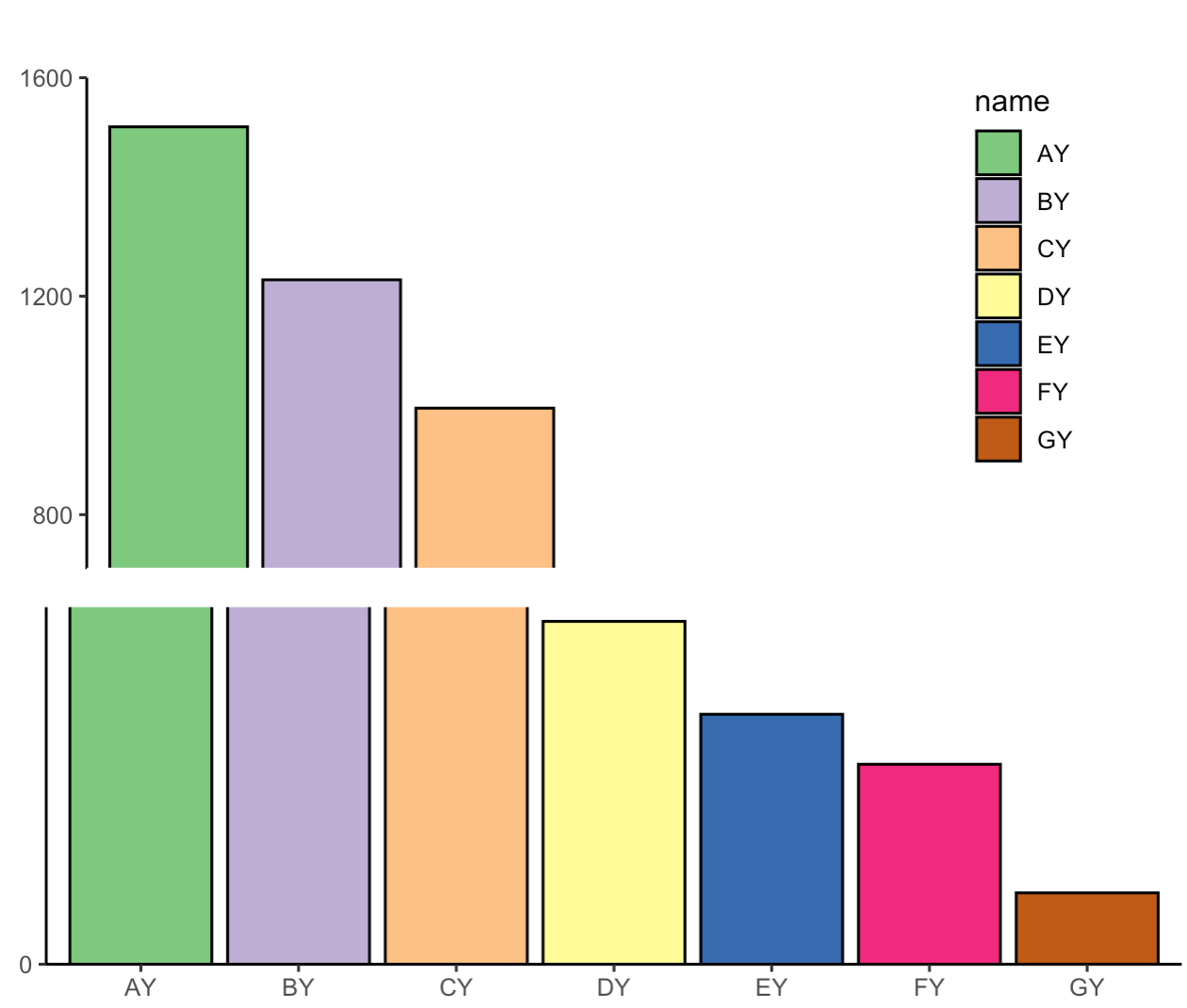
这种方法可以得到一个草图,图片对齐等细节调节需要多次尝试,或者可以导出在AI中修改。
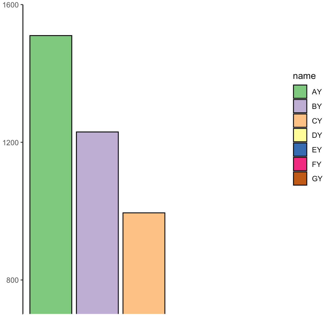
方法二:plotrix R包
plotrix R中包含gap.plot(),gap.barplot() 和 gapboxplot()函数, 可以分别画出坐标轴截断的散点图、柱状图和箱线图。主要参数包括y :要截断的数值向量; gap:截断的区间.
- ### 用法如下
- gap.barplot(y,gap,xaxlab,xtics,yaxlab,ytics,xlim=NA,ylim=NA,xlab=NULL,
- ylab=NULL,horiz=FALSE,col,...)
- ### Arguments
- y :要截断的数值向量
- gap :截断的区间
- xaxlab :labels for the x axis ticks
- xtics :position of the x axis ticks
- yaxlab :labels for the y axis ticks
- ytics :position of the y axis ticks
- xlim :Optional x limits for the plot
- ylim :optional y limits for the plot
- xlab :label for the x axis
- ylab :label for the y axis
- horiz :whether to have vertical or horizontal bars
- col :color(s) in which to plot the values
参考:http://www.bioon.com.cn/protocol/showarticle.asp?newsid=66061
相同的数据,画图如下
- #install.packages ("plotrix")
- library (plotrix)
- gap.barplot(df$Money,gap=c(50,740),xaxlab=df$name,ytics=c(50,700,800,900,1000,1100,1200,1300,1400,1500,1600),
- col=rainbow(7),xlim = c(0,8),width=0.06)
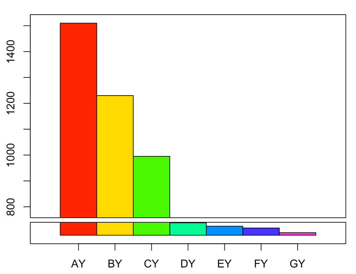
接着使用axis breaks()函数去除中间的两道横线,并添加截断的标记,如//或z。
Axis:1,2,3,4分别代表下、左、上、右方位的坐标轴,即打算截取的坐标轴breakppos:截断的位置,即截断符号添加的位置style: gap,slash和z字形
- axis.break(2,50,breakcol="snow",style="gap") ##去掉中间的那两道横线;
- axis.break(2,50*(1 0.02),breakcol="black",style="slash")##在左侧Y轴把gap位置换成slash;
- #axis.break(4,50*(1 0.02),breakcol="black",style="slash")##在右侧Y轴把gap位置换成slash;
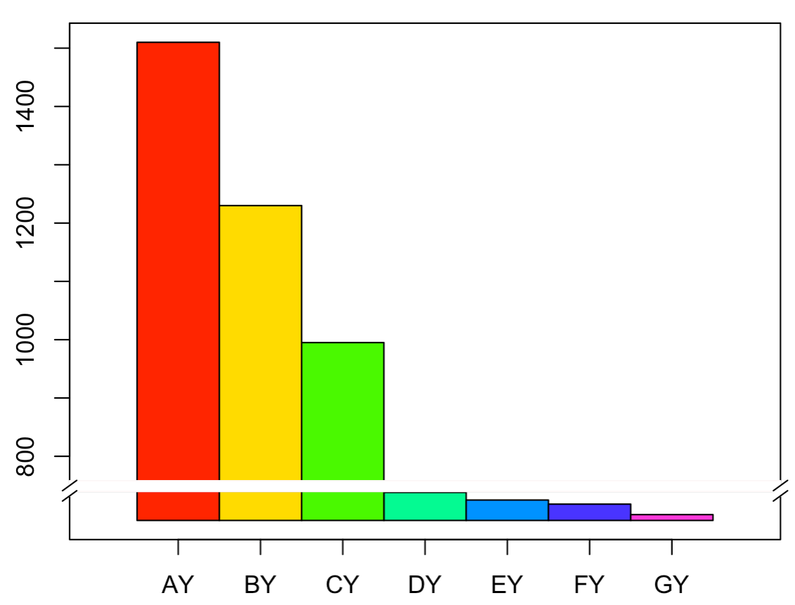
这种方法是基于base plot绘图的,但是base plot的许多绘图参数与gap.barplot()并不兼容,如space和width参数设置离坐标轴距离和bar的宽度。
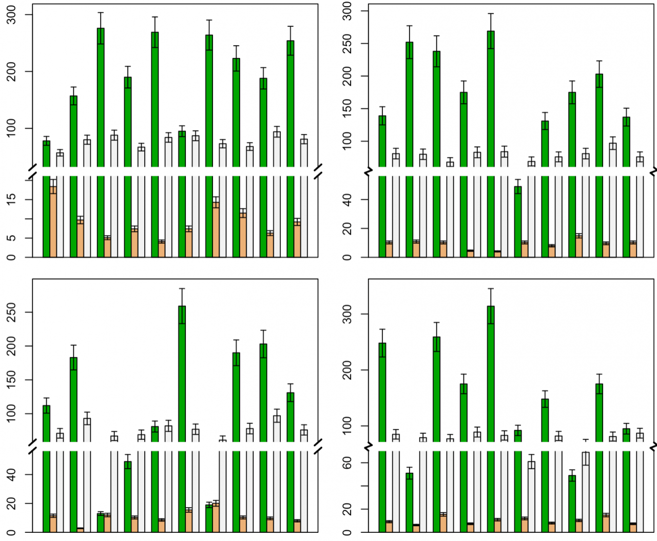
方法三:基本绘图函数 plotrix R包
参考:https://blog.csdn.net/u014801157/article/details/24372371
作者ZGUANG@LZU自己编写的函数,可以手动设置断点,也可以由函数自动计算。断点位置的符号表示提供了平行线和zigzag两种,并且可设置背景颜色、大小、线型、平行线旋转角度等。
函数
- #\' 使用R基本绘图函数绘制y轴不连续的柱形图
- #\'
- #\' 绘制y轴不连续的柱形图,具有误差线添加功能。断点位置通过btm和top参数设置,如果不设置,函数可自动计算合适的断点位置。
- #\' @title gap.barplot function
- #\' @param df 长格式的data.frame,即数据框中每一列为一组绘图数据。
- #\' @param y.cols 用做柱形图y值的数据列(序号或名称),一列为一组。
- #\' @param sd.cols 与y值列顺序对应的误差值的数据列(序号或名称)。
- #\' @param btm 低位断点。如果btm和top均不设置,程序将自动计算和设置断点位置。
- #\' @param top 高位断点。
- #\' @param min.range 自动计算断点的阈值:最大值与最小值的最小比值
- #\' @param max.fold 自动计算断点时最大值与下方数据最大值的最大倍数比
- #\' @param ratio 断裂后上部与下部y轴长度的比例。
- #\' @param gap.width y轴断裂位置的相对物理宽度(非坐标轴实际刻度)
- #\' @param brk.type 断点类型,可设为normal或zigzag
- #\' @param brk.bg 断点处的背景颜色
- #\' @param brk.srt 断点标记线旋转角度
- #\' @param brk.size 断点标记线的大小(长度)
- #\' @param brk.col 断点标记线的颜色
- #\' @param brk.lwd 断点标记线的线宽
- #\' @param cex.error 误差线相对长度,默认为1
- #\' @param ... 其他传递给R基本绘图函数barplot的参数
- #\' @return 返回barplot的原始返回值,即柱形图的x坐标
- #\' @examples
- #\' datax <- na.omit(airquality)[,1:4]
- #\' cols <- cm.colors(ncol(datax))
- #\' layout(matrix(1:6, ncol=2))
- #\' set.seed(0)
- #\' for (ndx in 1:6){
- #\' dt <- datax[sample(rownames(datax), 10), ]
- #\' par(mar=c(0.5,2,0.5,0.5))
- #\' brkt <- sample(c(\'normal\', \'zigzag\'), 1)
- #\' gap.barplot(dt, col=cols, brk.type=brkt, max.fold=5, ratio=2)
- #\' }
- #\' @author ZG Zhao
- #\' @export
- gap.barplot <- function(df, y.cols = 1:ncol(df), sd.cols = NULL, btm = NULL,
- top = NULL, min.range = 10, max.fold = 5, ratio = 1, gap.width = 1, brk.type = "normal",
- brk.bg = "white", brk.srt = 135, brk.size = 1, brk.col = "black", brk.lwd = 1,
- cex.error = 1, ...) {
- if (missing(df))
- stop("No data provided.")
- if (is.numeric(y.cols))
- ycol <- y.cols else ycol <- colnames(df) == y.cols
- if (!is.null(sd.cols))
- if (is.numeric(sd.cols))
- scol <- sd.cols else scol <- colnames(df) == sd.cols
- ## Arrange data
- opts <- options()
- options(warn = -1)
- y <- t(df[, ycol])
- colnames(y) <- NULL
- if (missing(sd.cols))
- sdx <- 0 else sdx <- t(df[, scol])
- sdu <- y sdx
- sdd <- y - sdx
- ylim <- c(0, max(sdu) * 1.05)
- ## 如果没有设置btm或top,自动计算
- if (is.null(btm) | is.null(top)) {
- autox <- .auto.breaks(dt = sdu, min.range = min.range, max.fold = max.fold)
- if (autox$flag) {
- btm <- autox$btm
- top <- autox$top
- } else {
- xx <- barplot(y, beside = TRUE, ylim = ylim, ...)
- if (!missing(sd.cols))
- errorbar(xx, y, sdu - y, horiz = FALSE, cex = cex.error)
- box()
- return(invisible(xx))
- }
- }
- ## Set up virtual y limits
- halflen <- btm - ylim[1]
- xlen <- halflen * 0.1 * gap.width
- v_tps1 <- btm xlen # virtual top positions
- v_tps2 <- v_tps1 halflen * ratio
- v_ylim <- c(ylim[1], v_tps2)
- r_tps1 <- top # real top positions
- r_tps2 <- ylim[2]
- ## Rescale data
- lmx <- summary(lm(c(v_tps1, v_tps2) ~ c(r_tps1, r_tps2)))
- lmx <- lmx$coefficients
- sel1 <- y > top
- sel2 <- y >= btm & y <= top
- y[sel1] <- y[sel1] * lmx[2] lmx[1]
- y[sel2] <- btm xlen/2
- sel1 <- sdd > top
- sel2 <- sdd >= btm & sdd <= top
- sdd[sel1] <- sdd[sel1] * lmx[2] lmx[1]
- sdd[sel2] <- btm xlen/2
- sel1 <- sdu > top
- sel2 <- sdu >= btm & sdu <= top
- sdu[sel1] <- sdu[sel1] * lmx[2] lmx[1]
- sdu[sel2] <- btm xlen/2
- ## bar plot
- xx <- barplot(y, beside = TRUE, ylim = v_ylim, axes = FALSE, names.arg = NULL,
- ...)
- ## error bars
- if (!missing(sd.cols))
- errorbar(xx, y, sdu - y, horiz = FALSE, cex = cex.error)
- ## Real ticks and labels
- brks1 <- pretty(seq(0, btm, length = 10), n = 4)
- brks1 <- brks1[brks1 >= 0 & brks1 < btm]
- brks2 <- pretty(seq(top, r_tps2, length = 10), n = 4)
- brks2 <- brks2[brks2 > top & brks2 <= r_tps2]
- labx <- c(brks1, brks2)
- ## Virtual ticks
- brks <- c(brks1, brks2 * lmx[2] lmx[1])
- axis(2, at = brks, labels = labx)
- box()
- ## break marks
- pos <- par("usr")
- xyratio <- (pos[2] - pos[1])/(pos[4] - pos[3])
- xlen <- (pos[2] - pos[1])/50 * brk.size
- px1 <- pos[1] - xlen
- px2 <- pos[1] xlen
- px3 <- pos[2] - xlen
- px4 <- pos[2] xlen
- py1 <- btm
- py2 <- v_tps1
- rect(px1, py1, px4, py2, col = brk.bg, xpd = TRUE, border = brk.bg)
- x1 <- c(px1, px1, px3, px3)
- x2 <- c(px2, px2, px4, px4)
- y1 <- c(py1, py2, py1, py2)
- y2 <- c(py1, py2, py1, py2)
- px <- .xy.adjust(x1, x2, y1, y2, xlen, xyratio, angle = brk.srt * pi/90)
- if (brk.type == "zigzag") {
- x1 <- c(x1, px1, px3)
- x2 <- c(x2, px2, px4)
- if (brk.srt > 90) {
- y1 <- c(y1, py2, py2)
- y2 <- c(y2, py1, py1)
- } else {
- y1 <- c(y1, py1, py1)
- y2 <- c(y2, py2, py2)
- }
- }
- if (brk.type == "zigzag") {
- px$x1 <- c(pos[1], px2, px1, pos[2], px4, px3)
- px$x2 <- c(px2, px1, pos[1], px4, px3, pos[2])
- mm <- (v_tps1 - btm)/3
- px$y1 <- rep(c(v_tps1, v_tps1 - mm, v_tps1 - 2 * mm), 2)
- px$y2 <- rep(c(v_tps1 - mm, v_tps1 - 2 * mm, btm), 2)
- }
- par(xpd = TRUE)
- segments(px$x1, px$y1, px$x2, px$y2, lty = 1, col = brk.col, lwd = brk.lwd)
- options(opts)
- par(xpd = FALSE)
- invisible(xx)
- }
- ## 绘制误差线的函数
- errorbar <- function(x, y, sd.lwr, sd.upr, horiz = FALSE, cex = 1, ...) {
- if (missing(sd.lwr) & missing(sd.upr))
- return(NULL)
- if (missing(sd.upr))
- sd.upr <- sd.lwr
- if (missing(sd.lwr))
- sd.lwr <- sd.upr
- if (!horiz) {
- arrows(x, y, y1 = y - sd.lwr, length = 0.1 * cex, angle = 90, ...)
- arrows(x, y, y1 = y sd.upr, length = 0.1 * cex, angle = 90, ...)
- } else {
- arrows(y, x, x1 = y - sd.lwr, length = 0.1 * cex, angle = 90, ...)
- arrows(y, x, x1 = y sd.upr, length = 0.1 * cex, angle = 90, ...)
- }
- }
- .xy.adjust <- function(x1, x2, y1, y2, xlen, xyratio, angle) {
- xx1 <- x1 - xlen * cos(angle)
- yy1 <- y1 xlen * sin(angle)/xyratio
- xx2 <- x2 xlen * cos(angle)
- yy2 <- y2 - xlen * sin(angle)/xyratio
- return(list(x1 = xx1, x2 = xx2, y1 = yy1, y2 = yy2))
- }
- ## 自动计算断点位置的函数
- .auto.breaks <- function(dt, min.range, max.fold) {
- datax <- sort(as.vector(dt))
- flags <- FALSE
- btm <- top <- NULL
- if (max(datax)/min(datax) < min.range)
- return(list(flag = flags, btm = btm, top = top))
- m <- max(datax)
- btm <- datax[2]
- i <- 3
- while (m/datax[i] > max.fold) {
- btm <- datax[i]
- flags <- TRUE
- i <- i 1
- }
- if (flags) {
- btm <- btm 0.05 * btm
- x <- 2
- top <- datax[i] * (x - 1)/x
- while (top < btm) {
- x <- x 1
- top <- datax[i] * (x - 1)/x
- if (x > 100) {
- flags <- FALSE
- break
- }
- }
- }
- return(list(flag = flags, btm = btm, top = top))
- }
示例数据
- datax <- na.omit(airquality)[, 1:4]
- cols <- terrain.colors(ncol(datax) - 1)
- layout(matrix(1:4, ncol = 2))
- set.seed(0)
- for (ndx in 1:4) {
- dt <- datax[sample(rownames(datax), 10), ]
- dt <- cbind(dt, dt[, -1] * 0.1)
- par(mar = c(1, 3, 0.5, 0.5))
- brkt <- sample(c("normal", "zigzag"), 1)
- gap.barplot(dt, y.cols = 2:4, sd.cols = 5:7, col = cols, brk.type = brkt,
- brk.size = 0.6, brk.lwd = 2, max.fold = 5, ratio = 2, cex.error = 0.3)
- }
实际数据
- gap.barplot(df, y.cols = 2, brk.type = "normal",col = rainbow(7),
- brk.size = 0.6, brk.lwd = 2, max.fold = 5, ratio = 2, cex.error = 0.3)
第3种方法可以直接计算截断值,另外可以添加error bar, 可以修改的细节处更多,而且包装成函数,整个分析时间也加快。