

本文在做学术论文中,正好想做一下把y轴一些数据进行截断的效果。通过网上检索,整理了一下两种方式构建坐标轴截断图。
plotrix包
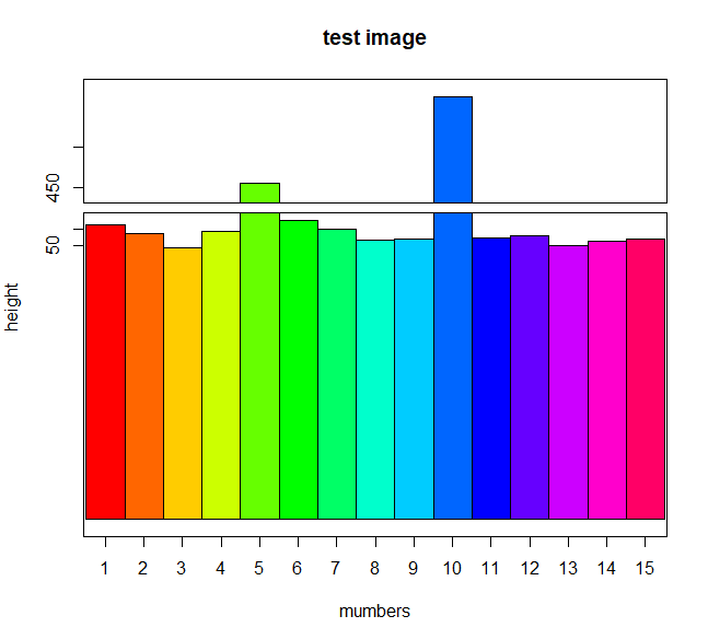
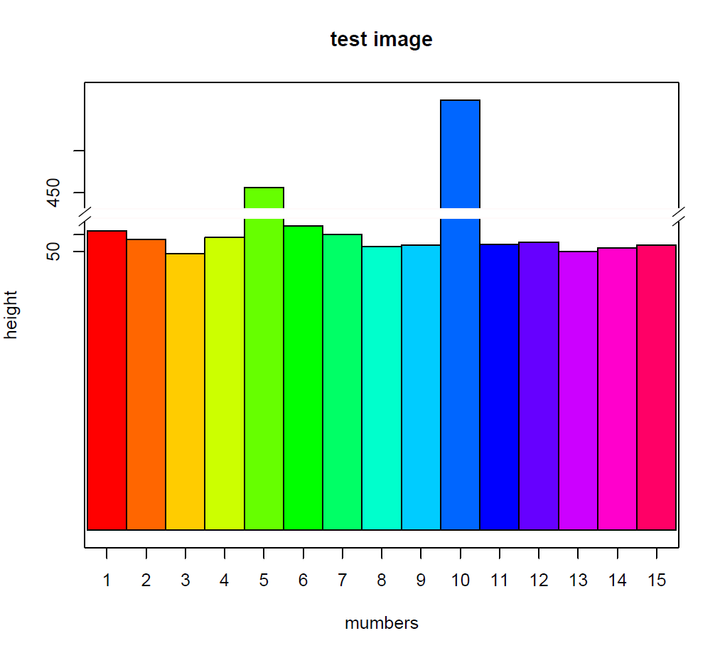
利用gap.barplot()进进行绘制,将gap参数设置为90,420进行y轴截断,可加入参数axis.break()对截断形状进行修改。
下面两第一个图是未加axis.break()的结果,第二幅是加了该参数的结果。
- library(plotrix)
- w <- c(75, 64.4, 47.3, 66.9, 456, 80.6, 70, 55.8, 57.9, 561, 58.6, 61.2, 50.3, 54.6, 57.8)
- x <- c(1:15)
- gap.barplot(w,gap=c(90,420),xaxlab=x,ytics=c(50,70,450,500),col=rainbow(15),xlab ="mumbers", ylab = "height", main="test image")
- ## ylim -282.7 231
- axis.break(2,90,breakcol="snow",style="gap")##去掉中间的那两道横线;
- axis.break(2,90*(1+0.02),breakcol="black",style="slash")##在左侧Y轴把gap位置换成slash;
- axis.break(4,90*(1+0.02),breakcol="black",style="slashuah")##在右侧Y轴把gap位置换成slash;
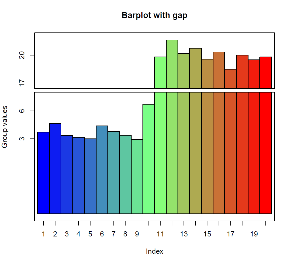
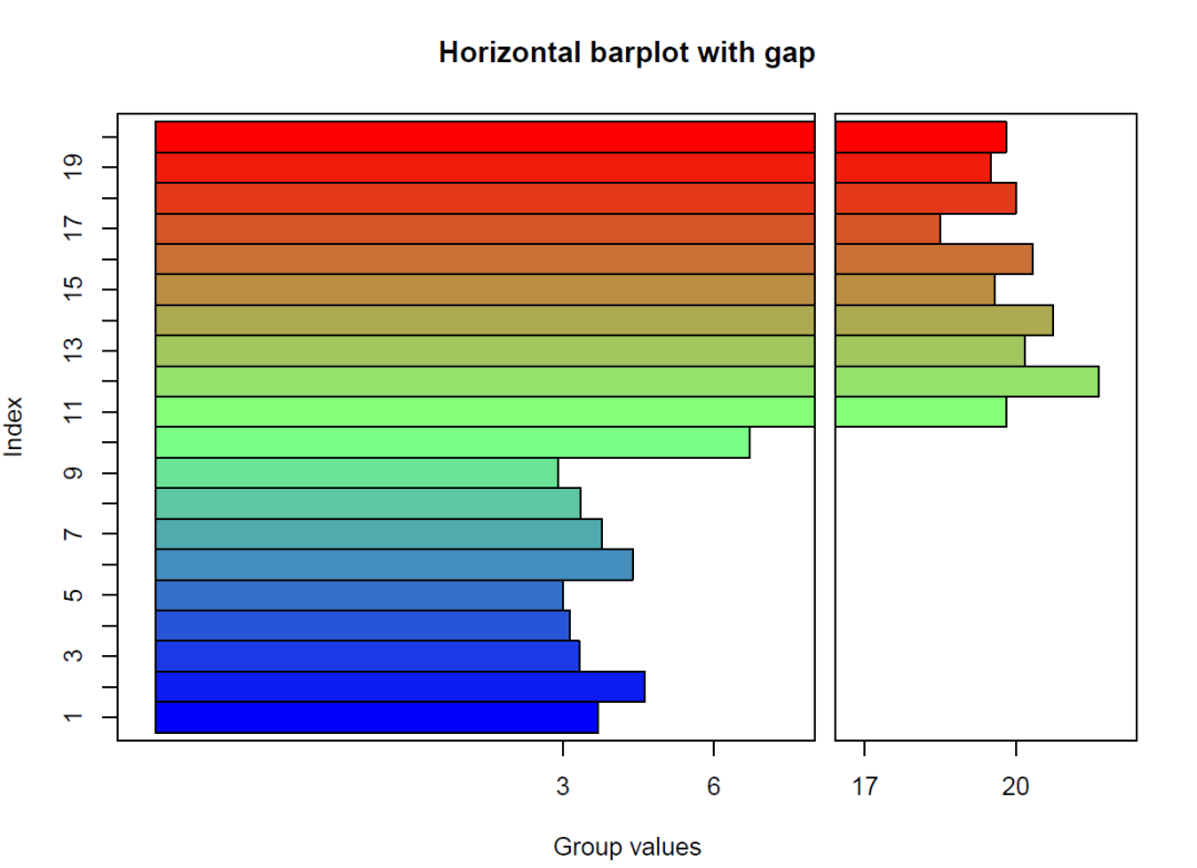
其他案例(官方里面的案例):可将利用horiz=TRUE将图横着画。
- twogrp<-c(rnorm(10)+4,rnorm(10)+20)
- gap.barplot(twogrp,gap=c(8,16),xlab="Index",ytics=c(3,6,17,20),
- ylab="Group values",main="Barplot with gap")
- ## ylim -5.809 13.25
- gap.barplot(twogrp,gap=c(8,16),xlab="Index",ytics=c(3,6,17,20),
- ylab="Group values",horiz=TRUE,main="Horizontal barplot with gap")
- ## ylim -5.809 13.25
ggplot2包
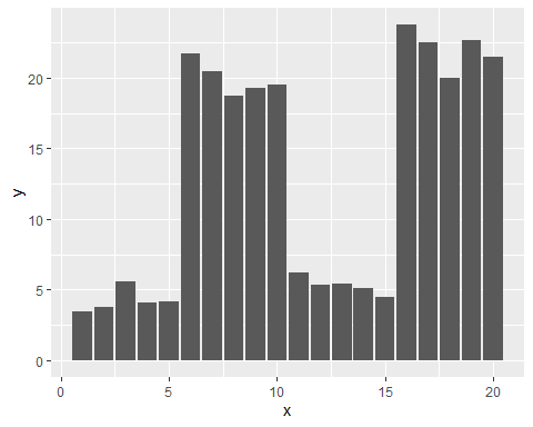
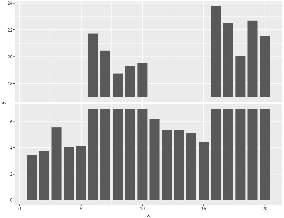
第二种方式是利用ggplot2进行绘制。首先随机构造一个数据,,我们想把y为7~17的数数据进行截断。思路是:构造一列:type,把小于7的命名为“samll”,大于17的命名为“big”,然后利用facet效果构建图。
- library(ggplot2)
- set.seed(123)
- d <- data.frame(
- x = 1:20,
- y = c(rnorm(5) + 4, rnorm(5) + 20, rnorm(5) + 5, rnorm(5) + 22)
- )
- ggplot(d, aes(x, y)) + geom_col()
- library(dplyr)
- breaks = c(7, 17)
- d$type <- NA
- d$type[d$y < breaks[1]] = "small"
- d$type[d$y > breaks[2]] = "big"
- d <- filter(d, .type == 'big') %>%
- mutate(type = "small", y = breaks[1]) %>%
- bind_rows(d)
- mymin = function(y) ifelse(y <= breaks[1], 0, breaks[2])
- p <- ggplot(d, aes(x, y)) +
- geom_rect(aes(xmin = x - .4, xmax = x + .4, ymin = mymin(y), ymax = y)) +
- facet_grid(type ~ ., scales = "free") +
- theme(strip.text=element_blank())
- p
参考资料:
R语言作图——坐标轴截断画图
http://blog.sina.com.cn/s/blog_6a4ee1ad0102x5at.html
ggplot坐标轴截断
https://www.jianshu.com/p/0e4fa8849479